

Did you know that colors can greatly influence our emotions and even the way we perceive fashion?
Scientific research shows that colors evoke feelings and moods that impact our daily lives. For the Fall/Winter 2025-2026 season, Pantone Color Institute has released its official Color Palette, highlighting shades that will shape fashion trends worldwide. Pantone introduces the main color of the season, a vibrant and versatile selection of ten standout shades alongside five seasonless classics—a palette that speaks to resilience, creativity, and self-expression. These colors are not just trends—they are reflections of our collective mood, desires, and aspirations.
In this article, we will explore these key colors and their characteristics and suggest winning color combinations to elevate your winter wardrobe—accompanied by curated imagery inspired by the Pantone palette, capturing the feel and essence of the season.
The Color of the Season: Mocha Mousse (17-1230 TCX)
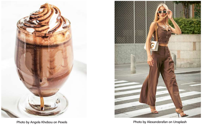
Pantone’s chosen color for Winter 2025/26 is Mocha Mousse (17-1230 TCX), a warm, rich brown with subtle orange undertones. This inviting shade brings comfort and calm, perfect for colder months, reflecting natural earth tones that feel both mellow and soothing. Demonstrating its ver—satility, it pairs beautifully with soft neutrals, vibrant reds, and cool blues. Gentle, discreet, and sophisticated, Mocha Mousse is a creamy brown that speaks of understated luxury. It thrives in monochromatic layering, especially in soft textures like cashmere, brushed wool, and suede. The color of quiet confidence is wearable, versatile, and timeless, with a modern twist.
Main Colors F/W 2025/26
1. Lemon Grass (12-0626 TCX)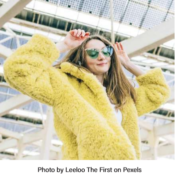
Mood: Revitalizing, Lively, Optimistic
Color: A fresh yellow-green that injects vibrant energy into winter collections, bringing a zestful pop of brightness to the season’s muted palette. This invigorating hue sparks creativity and optimism, adding a crisp, forward-looking feel to winter wardrobes.
How to wear it: Perfect for statement outerwear, lightweight knits, and layering, Lemon Grass adds a vibrant, cheerful touch. Pair with warm neutrals or soft blues for a fresh, modern look.
Fabrics: Ideal for crisp cottons, lightweight wools, silks, and technical fabrics that highlight its freshness with ease.
Suggested combo: Lemon Grass + French Roast
 2. Brandied Melon (16-1340 TCX)
Mood: Eclectic, Welcoming, Uplifting
Color: Brandied Melon glows with gentle charm, blending soft orange, and peachy undertones that feel both inviting and cozy. This radiant hue infuses vitality into autumn’s palette, offering a bright yet anchored-in-warmth option that refreshes and enlivens the season’s mood.
How to wear it: Perfect for cozy knits, sweaters, and statement outerwear, Brandied Melon adds comforting energy to everyday looks. Pair with neutrals or deep blues for a vibrant, balanced outfit.
Fabrics: Ideal for soft knits, brushed wools, lightweight cashmere, textured cottons, and smooth silks that enhance its warm, inviting glow.
Suggested combo: Brandied Melon + Lyons Blue
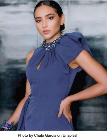
3. Lyons Blue (19-4340 TCX)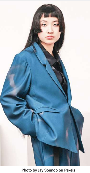
Color: Elegant, elemental, and quietly powerful, Lyons Blue is the thinking person’s navy. Darker than denim and richer than ink, it brings depth and sophistication to the season, offering a contemporary alternative to black with a distinctly intellectual edge.
How to wear it: Ideal for tailored suits, structured ts, and refined separates, Lyons Blue balances masculinity and elegance with ease. Pair with warm neutrals or crisp whites for effortless sophistication.
Fabrics: Best realized in fine wool, gabardine, silk blends, and polished cotton— fabrics that highlight its structured, refined character.
Suggested combo: Lyons Blue + Hot Chocolate
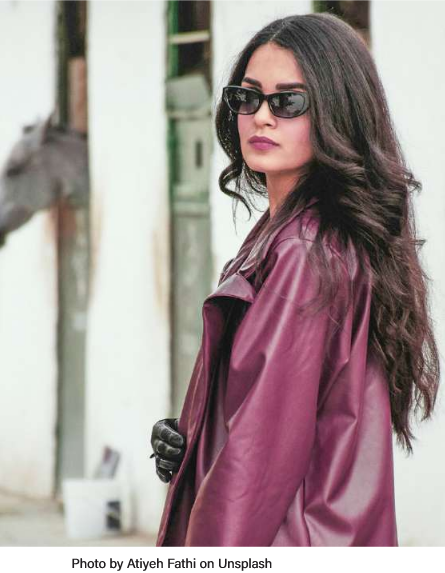 4. Damson (18-1716 TCX)
Mood: Deep, Moody, Mysterious
Color: Utterly luxurious, Damson sits between plum and aubergine—rich with emotion, depth, and quiet mystery. This refined shade adds mood and modern romance, bringing an artistic, almost cinematic allure to autumn’s palette and beyond.
How to wear it: Ideal for statement outerwear, tailored pieces, and eveningwear, Damson exudes unconventionality. Pair with rich textures or tonal layers for a powerful and edgy look.
Fabrics: Striking on plush velvets, satin, wool, and leather materials that enhance its depth and luxurious character.
Suggested combo: Damson + Primrose Pink
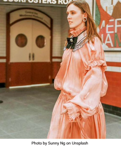
5. Primrose Pink (12-2904 TCX)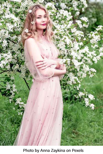
Mood: Romantic, Dreamy, Ethereal
Color: Delicate and chic, Primrose Pink adds softness and lightness to winter’s heavier tones. It pairs beautifully with neutrals and richer hues, offering a gentle, feminine contrast. Reimagined as both romantic and strong, this pink is here to stay.
How to wear it: Ideal for soft knits, flowing dresses, and lightweight outerwear, Primrose Pink brings a feminine feel to your wardrobe taples, adding a touch of delicate elegance to everyday looks.
Fabrics: Best realized in silk, chiffon, soft knits, and lightweight wool—fabrics that emphasize its delicate and airy nature.
Suggested combo: Primrose Pink + Winterberry
6. Winterberry (17-1640 TCX)
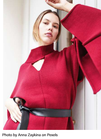 Mood: Vibrant, Magnetic, Exuberant
Color: A deeper, more enigmatic take on red, Winterberry merges berry undertones with quiet sophistication. Romantic yet refined, it infuses the season with depth and modern allure, shining in pieces that feel expressive yet effortlessly wearable.
How to wear it: Perfect for fluid dresses, statement outerwear, and evening pieces, Winterberry adds a rich focal point. Pair with neutrals for balance or warm tones for a bolder touch.
Fabrics: Elegantly rendered in silk, velvet, satin, and soft knits—fabrics that highlight its rich, luxurious depth.
Suggested combo: Winterberry + Bright White
7. Hot Chocolate (19-1325 TCX)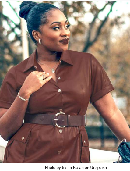
Mood: Quiet, Stable, Understated
Color: Nothing says comfort like a saturated, earthy brown—Hot Chocolate delivers cozy vibes in full. A neutral with personality, it’s perfect for timeless staples and everyday elegance. Bring it to life through layering and tailored silhouettes that feel alanced yet luxurious.
How to wear it: Perfect for tailored coats, knitwear, and classic separates that anchor your wardrobe with quiet luxury. Pair with soft neutrals for comfort or layer with deeper tones for subtle depth.
Fabrics: Beautifully rendered in wool, cashmere, suede, and soft leather materials that highlight its warmth and timeless appeal.
Suggested combo: Hot Chocolate + French Roast
8. Chili Oil (18-1440 TCX)
 Mood: Warm, Spicy, Authentic
Color: Chili Oil brings a smoldering heat to the cold season. This reddish-brown-orange hue strikes the perfect balance—bold yet restrained, offering a handcrafted, artisanal feel with a worldly, sophisticated edge that adds intensity and character to any palette.
How to wear it: Perfect for statement outerwear, tailored pieces, and accessories that add earthy, spicy accents. Pair with muted neutrals or layer with deep browns and vibrant reds for strong impact.
Fabrics: Perfectly showcased in rich leathers, textured wools, soft suede, and luxurious knits—fabrics that echo its artisanal character.
Suggested combo: Chili Oil + French Roast
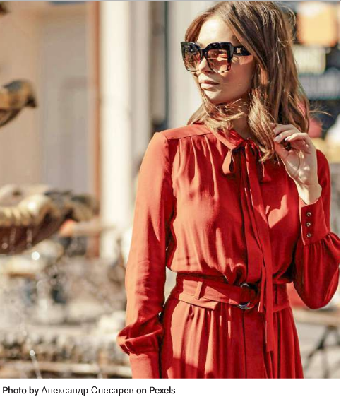
9. Poppy Red (17-1664 TCX)
Mood: Energetic, Passionate, Bold
Color: Impossible to ignore, Poppy Red bursts into the season with raw, unapologetic energy. This vibrant crimson commands attention, infusing every look with confidence and modern allure. A statement shade that doesn’t follow trends—it defines them.
How to wear it: Ideal for show-stopping dresses, bold outerwear, and statement accessories, Poppy Red adds instant flair. Pair with muted neutrals or layer with tonal reds and warm accents.
Fabrics: Best expressed in glossy patent leather, flowing silk, plush velvet, and sleek satin—fabrics that amplify its vibrant, confident energy.
Suggested combo: Poppy Red + Mocha Mousse
10. Bronze Brown (18-0937 TCX)
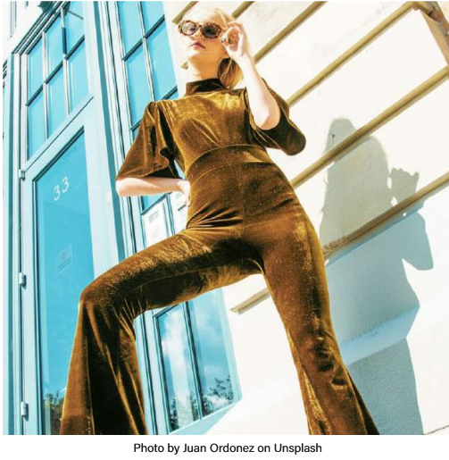 Mood: Lustrous, Nostalgic, Introspective
Color: Earthy and elegant, Bronze Brown strikes a balance between strength and sophistication. Its vintage warmth brings a sense of grounded luxury to any winter wardrobe. A quietly confident hue that never tries too hard but always leaves a lasting impression.
How to wear it: With rich metallic undertones and a deep chocolate base. Bronze Brown suits accessories, outerwear, and structured pieces like leather bags, croc boots, and classic coats.
Fabrics: Beautifully rendered in supple leather, rich suede, soft wool, and luxurious velvet, enhancing its vintage appeal.
Suggested combo: Bronze Brown + Lemon Grass
Seasonless Colors (Year-Round Essentials)
1. Bright White (11-0601 TCX)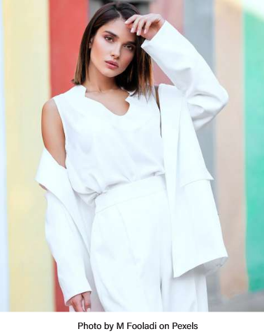
Mood: Clean, Modern, Essential
Color: A luminous, optic white that embodies clarity and restraint, reflecting a serene sense of calm precision and effortless modernity. Its pristine tone brings lightness, harmony, and balance to the palette, elevating every shade with subtle sophistication.
How to wear it: Perfect for minimalist tailoring and streamlined layering, Bright White adds clarity and composure. Ideal for power suits, coats, or a soft scarf, it balances strength and elegance with ease.
Fabrics: Works beautifully on crisp cotton, structured wool, sleek leather, and soft cashmere, emphasizing its purity and poised simplicity.
Suggested combo: Bright White + Damson
2. French Roast (19-1012 TCX)
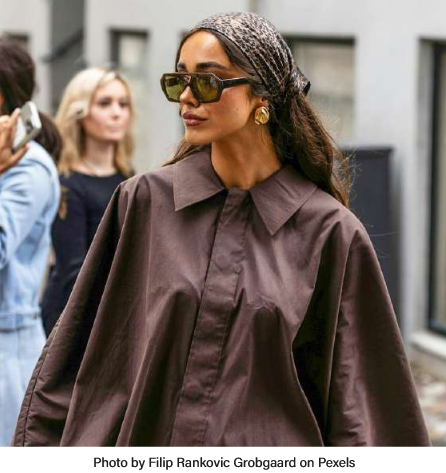 Mood: Solid, Earthy, Deep
Color: A deep, indulgent brown enriched with subtle toasted undertones, French Roast adds effortless sophistication to the palette. It radiates quiet strength and understated polish, wrapping every piece in an aura of worldly warmth and quiet elegance.
How to wear it: Ideal for tailored coats and structured knits, it brings anchored comfort to classic silhouettes. Perfect for layering rich textures and bringing depth to both casual and elevated ensembles.
Fabrics: Ideal for textured materials like brushed wool, soft suede, ribbed knits, and supple leather that highlight its rich warmth and depth.
Suggested combo: French Roast + Bright White
3. Vapor Blue (14-4203 TCX)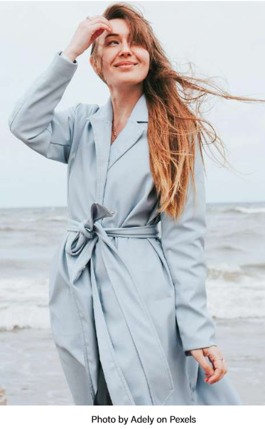
Mood: Calm, Soft, Muted
Color: A tranquil blue-gray wrapped in smoky softness, Vapor Blue evokes a sense of quiet strength and serene calm. Its misty, ethereal undertones balance warmth with cool restraint, introducing layered tonality and a gentle clarity that brings modern polish to winter palettes.
How to wear it: Pairs beautifully with soft, muted neutrals for an elevated, serene look, or with rich warm earthy tones for a modern, striking contrasting statement.
Fabrics: Captivates on materials that highlight depth and texture—think brushed wool, soft suiting, smooth satin, or structured cotton blends.
Suggested combo: Vapor Blue + Damson
 4. Crown Blue (19-3926 TCX)
Mood: Reliable, Classic, Elegant
Color: A dependable and understated blue that embodies enduring confidence, quiet authority, and lasting appeal. Crown Blue gracefully bridges classic tradition with modern resonance, capturing the essence of classic elegance infused with subtle contemporary refinement.
How to wear it: Perfect for structured outerwear and tailored suits, Crown Blue adds depth to day and evening looks. Pair with neutrals for timeless polish or warm earth tones for contrast.
Fabrics: Best on structured fabrics like wool, cashmere, twill, silk satin, and leather—highlighting this classic blue’s depth and sophistication.
Suggested combo: Crown Blue + Mauve Wine
5. Mauve Wine (19-1716 TCX)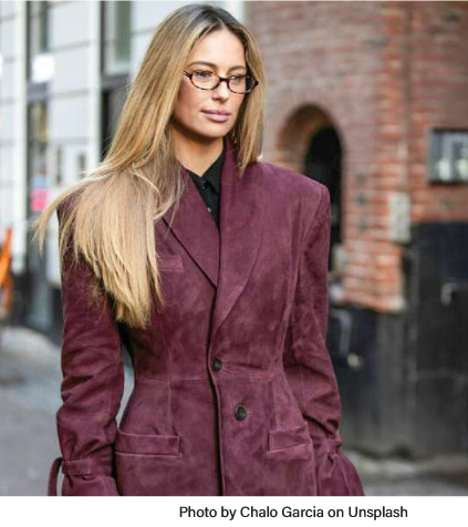
Mood: Elegant, Poetic, Enigmatic
Color: A sophisticated purple with soft dramatic un- dertones, Mauve Wine evokes modern romance and quiet mystery—perfect for those who embrace feminine yet bold tones. This romantic purple-wine shade brings depth and softness to any winter palette.
How to wear it: Perfect on knitwear and outerwear; style with neutral accessories for understated elegance or mix boldly with warm tones to make a statement.
Fabrics: Best showcased on fabrics that play with light and texture like velvet, silk, chiffon, soft knits, and leather.
Suggested combo: Mauve Wine + French Roast
Unexpected Color Pairings: The Key Fashion Trend of Fall/Winter 2025/26
This season’s designers are boldly experimenting with unexpected color pairings that break traditional rules, creating fresh, dynamic looks. Think Poppy Red with Crown Blue or Lemon Grass paired with French Roast—combinations that infuse vibrancy and sophistication into winter wear. These mixes celebrate individuality and invite fashion lovers to experiment and stand out.
Conclusion:
The Winter 2025/26 palette celebrates warmth, depth, and unexpected contrasts. From the comforting embrace of Mocha Mousse to the vibrant energy of Poppy Red, these colors offer endless styling possibilities to express personality and mood. Embrace these hues to revitalize your winter wardrobe, explore bold combinations, and add a new dimension of color to your fashion story.
Ready to make a statement this season? Dive into Pantone’s palette, mix unexpected shades, and let your style shine through the colder months with confidence and flair.
Disclaimer:
The Pantone colors referenced are provided for editorial and informational purposes only. The accompanying images serve as visual interpretations and are not official Pantone materials.
About the Author
 Mihaela is a fashion designer based in Rome, Italy. She has always considered aesthetics not as something superficial, but as a window into one’s true identity. What we cannot—or choose not to—express through words often finds expression through our overall appearance. Inspired by the fusion of art and design, she constantly seeks new ways to challenge boundaries and explore unconventional ideas, as she believes that fashion is a powerful form of self-expression. She is continually seeking meaningful opportunities and creative challenges that allow her to expand her perspective and fulfill her potential as a fashion designer. Curiosity and intuition drive her process, transforming each project into a reflection of concept and creative freedom.


